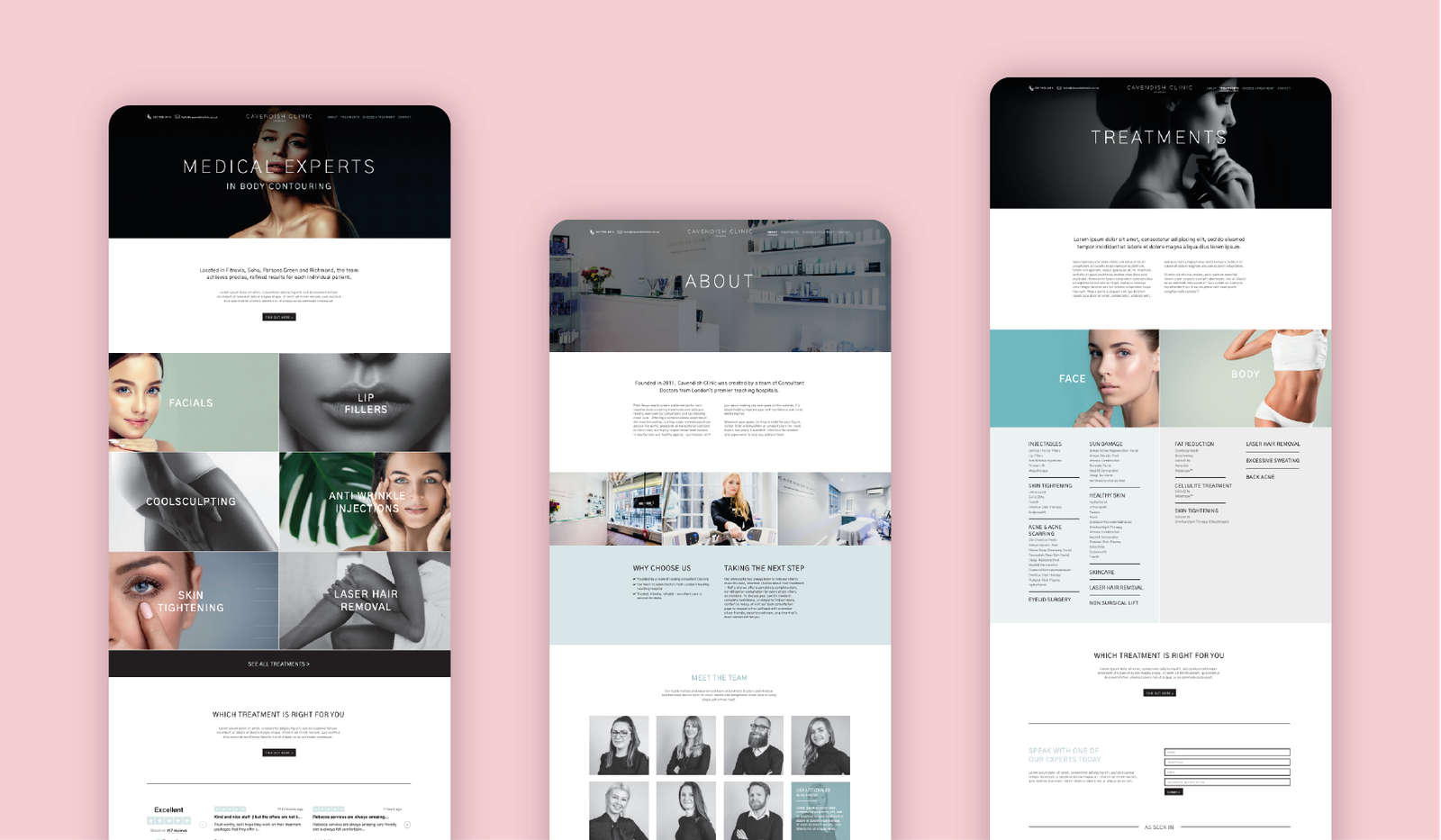
This concept was aimed at improving the global navigation for the PCA Skin. The use of a mega-menu navigation allows for easy access to product pages that typically may not receive a lot of exposure and traffic, due to the sheer number of products available. With the mega-menu, through the action of simply hovering over a menu option, the user is able to scan-read options within seconds of entering the site. Deliver a more purposeful and effortless user journey.
The use of playful, lifestyle imagery is a great tactic to inject energy into an e-commerce website, which naturally are of course very product image heavy. Selecting imagery with a vivid and dynamic colour palette is recommended in instances where restricting brand guidelines are in place.


