A new website to not only improve user navigation (the previous user journey was convoluted and lacked structure), but to also bring an element of design consistency and brand identity to their core marketing tool. Ensuring there was a consistent brand look and feel throughout the entire user journey and across key touchpoints.
We made a conscious effort to have Milligan's case studies front and center. With intrinsic call-to-actions to make the path to conversion as quick and easy as possible for the user.


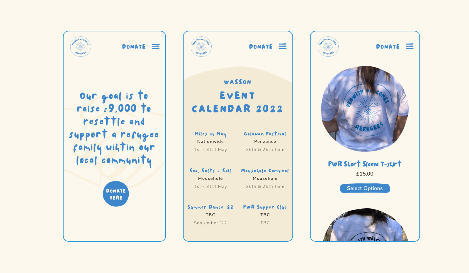
 PENWITH WELCOMES REFUGEES
 THE TRAFFORD CENTRE
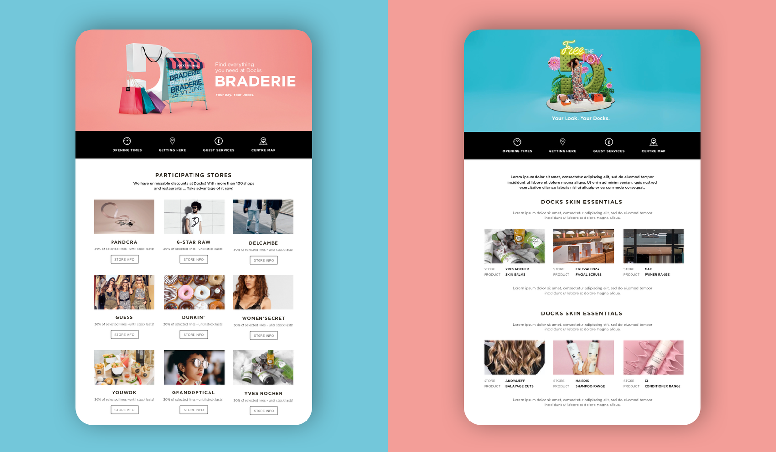
 DOCKS BRUXSEL
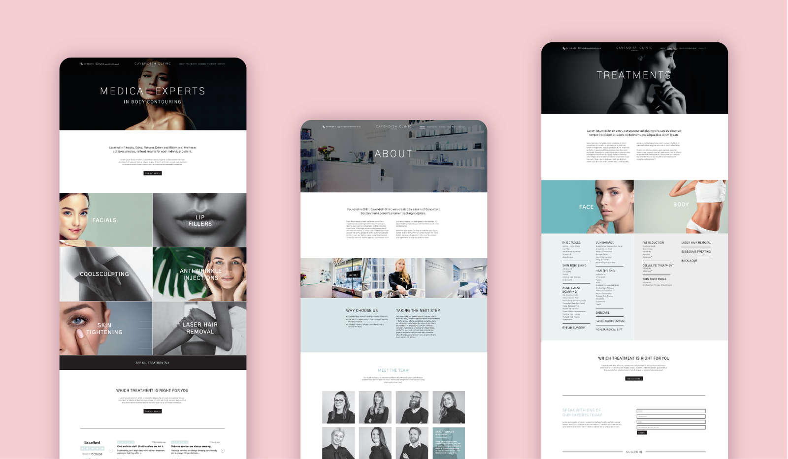
 CAVENDISH CLINIC